i. Approachable
Approachable
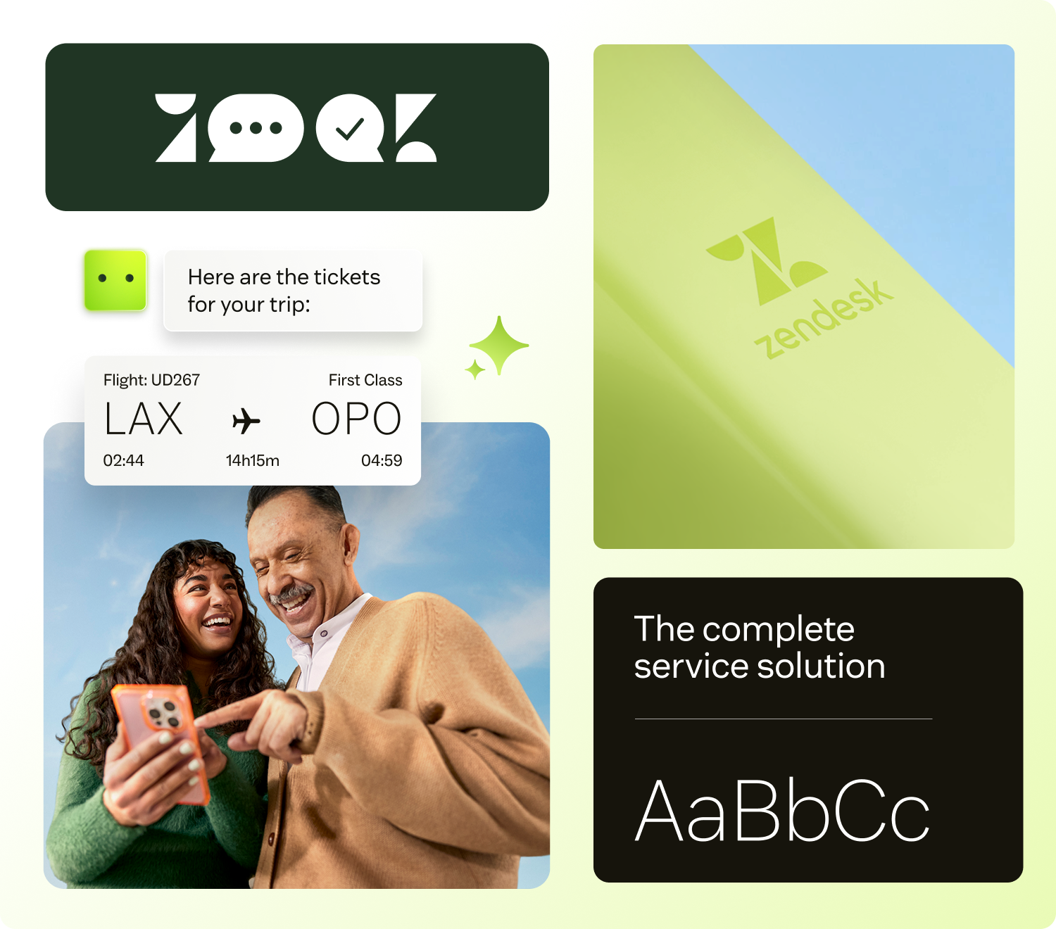
Great technology should feel intuitive. We present our brand in a way that's welcoming, clear, and easy to understand — no jargon, no barriers, just solutions designed for everyone.
Zendesk's AI-friendly digital design and development library — built on the language of resolution.
When things go sideways, you want service you can count on. You reach out for help, and the support you receive feels just right. Zendesk is behind it all — ensuring you get exactly what you need when you need it.
We're committed to every interaction ending in resolution, no matter what comes your way. So the brands you're loyal to can show up for you, how you want them to. Because you are the customer, and we know the customer is always human.
Five attributes guide every visual and verbal decision. Together they form the unmistakable Zendesk voice — approachable, modern, trusted, connected, and fresh.
Great technology should feel intuitive. We present our brand in a way that's welcoming, clear, and easy to understand — no jargon, no barriers, just solutions designed for everyone.
Innovation is in our DNA. Through bold, forward-thinking expressions of our brand, we communicate that we're not just keeping up with the future — we're building it.
We're advocates for consistency and quality. Every touchpoint reinforces reliability, from the precision of our design to the confidence we foster in the services we provide.
To lead the way, we stay relevant. Our brand speaks to the needs of our customers and reflects the culture of the moment, ensuring we shape the conversation rather than just join it.
Our visual and verbal identity mirrors the elegance of our solutions. Clean, intuitive design proves that embedding AI into customer experiences can be as seamless as it is transformative.
Our design system guides customers from challenge to resolution through clean, intentional choices. Simple forms create clarity; gradients and shapes signal the path forward. Every visual element reinforces our core purpose.
A foundational visual device showing the movement toward resolution.
Soft edges create depth with sophistication, balancing emphasis with elegant transitions.
Simple, universal symbols distill complex ideas into the essentials.
Rounded corners add a sense of approachability and a contemporary feel.
Backgrounds imply movement toward resolution while providing contrast and accent.
The Zendesk logo is made up of two elements: our symbol and wordmark. It is the biggest visual identifier of our brand.
Reference these color values for digital (RGB) and print (CMYK and PMS) applications. Matcha is reserved for primary actions and accents — use it sparingly.
Zendesk Sans is the brand's primary typeface. Zendesk Mono is used for technical detail, supertitles, and metadata. Together they create a clear hierarchy without ornament.
Pre-built UI elements built from the design tokens. Compose them freely; never modify their internals.
Primary buttons use Matcha for high visibility. Limit to one or two per page. Secondary buttons handle less prominent actions.
Consistent colors, spacing, and typography variables for every component.
Pre-built UI elements with responsive properties that adapt to breakpoints.
Components with built-in margins organized by breakpoint for consistent layouts.
Greenhouse uses an 8px-based spacing system for consistent layouts. Stick to these values; never improvise.
Imagery complements messaging and adds vibrancy to layouts. These rules keep our visual language consistent across every surface.
Always mask imagery in rounded rectangles to maintain visual consistency with the design system. Avoid circles, polygons, or other shapes.
For product UI screenshots, don't let imagery blend into the background. Use drop shadows or borders to ensure sufficient contrast and definition.
For general photography and marketing images, avoid adding borders. Let images breathe naturally within the layout.
Shadows distinguish elements and create hierarchy. Reserve S4 for modals, videos, tours, and other elements above an overlay.
Rounded corners are central to the brand's approachable feel. Use these standardized values across components and surfaces.
All interactive elements get a visible matcha focus ring with a 2px offset. Never remove the focus outline — it's required for keyboard accessibility.